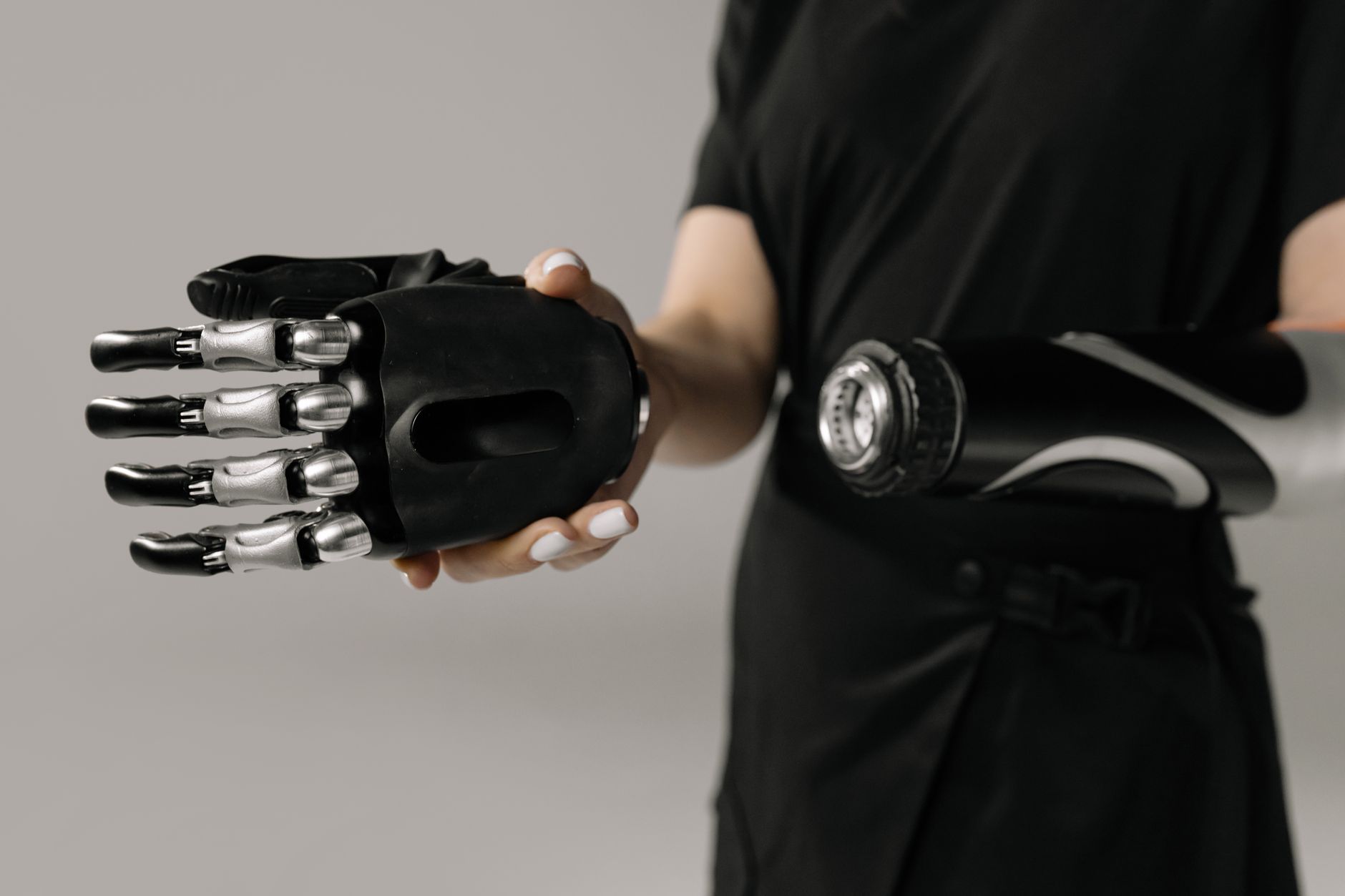
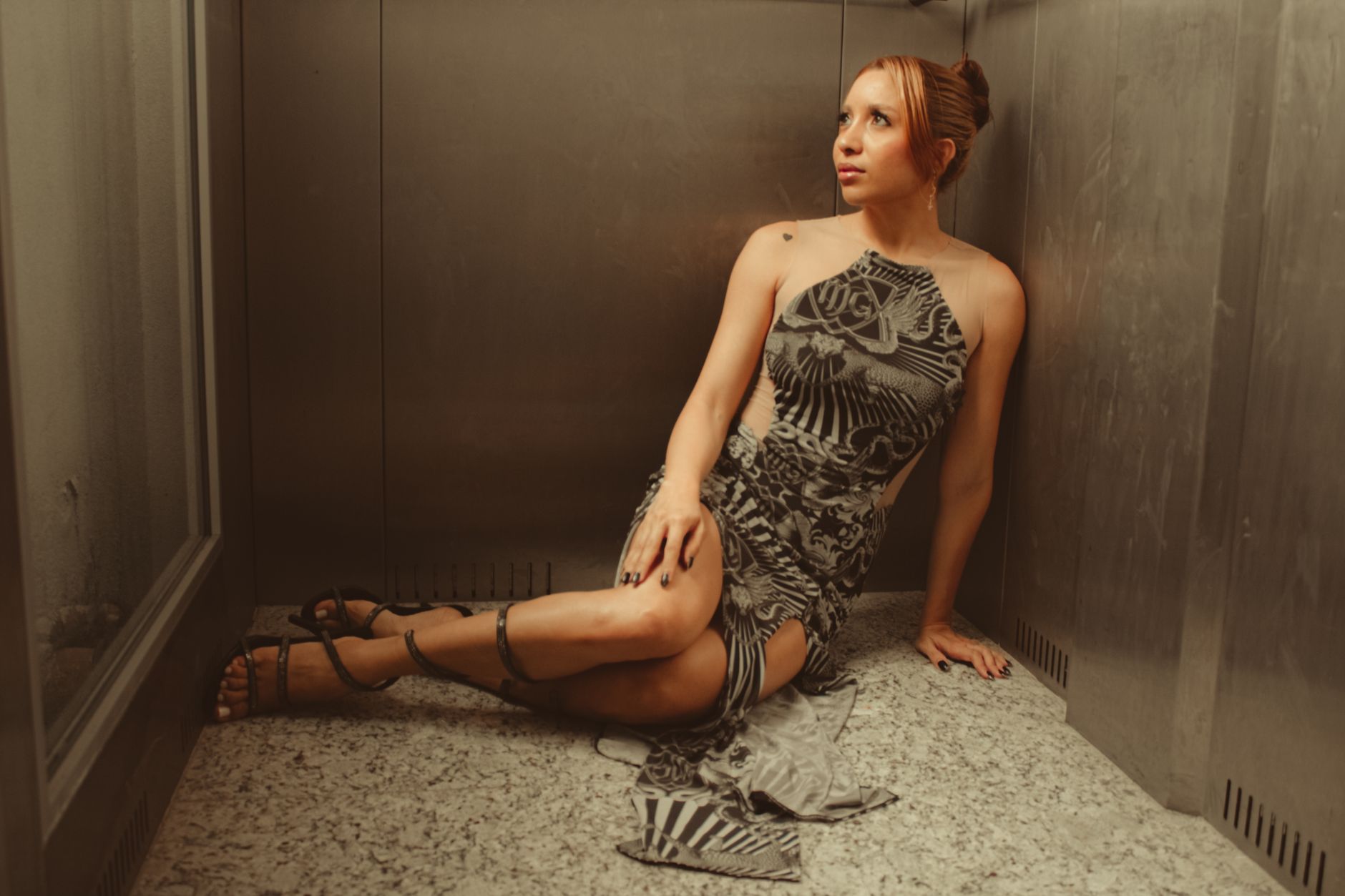
Somewhere between 2016's millennial pink and today's aluminum interiors, neutral stopped meaning natural. The beiges and taupes that once suggested approachability—a linen shirt, a camel coat, the promise of warmth without drama—have calcified into something colder. Gray took over. Then gray went blue. Now we're swimming in ice tones that photograph well and feel like nothing.
This isn't minimalism with soul. It's the aesthetic equivalent of room temperature, which is to say: slightly unsettling when you're expecting warmth. Fashion's neutral palette has become so clinical, so algorithmically optimized for feeds and resale value, that it's lost the plot entirely. Hospitality implies welcome. These colors imply an appointment you can't miss.
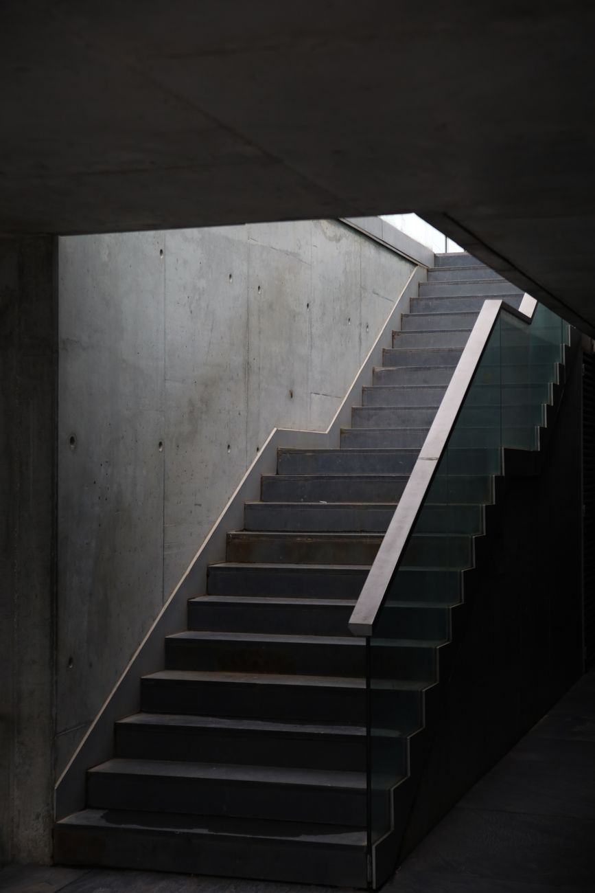
Greige was the gateway drug to emotional nothing
Gray-beige hybrid ruled the 2010s because it photographed neutrally across devices—the first color optimized for screens rather than eyes. It promised sophistication without commitment, depth without risk. What it actually delivered was the visual equivalent of holding your breath. Every showroom, every capsule wardrobe, every "investment piece" arrived in greige, and we stopped noticing that nothing felt like home anymore.

Showroom dressing became the default uniform
Walk into any boutique hotel or direct-to-consumer flagship and the staff are dressed like they're part of the architecture. Charcoal, slate, dove, ash—names that sound like paint chips because they are paint chips. This isn't service industry polish; it's the erasure of personality in favor of frictionless transactions. When your uniform could be mistaken for a concrete wall, you've stopped dressing humans and started outfitting environments.
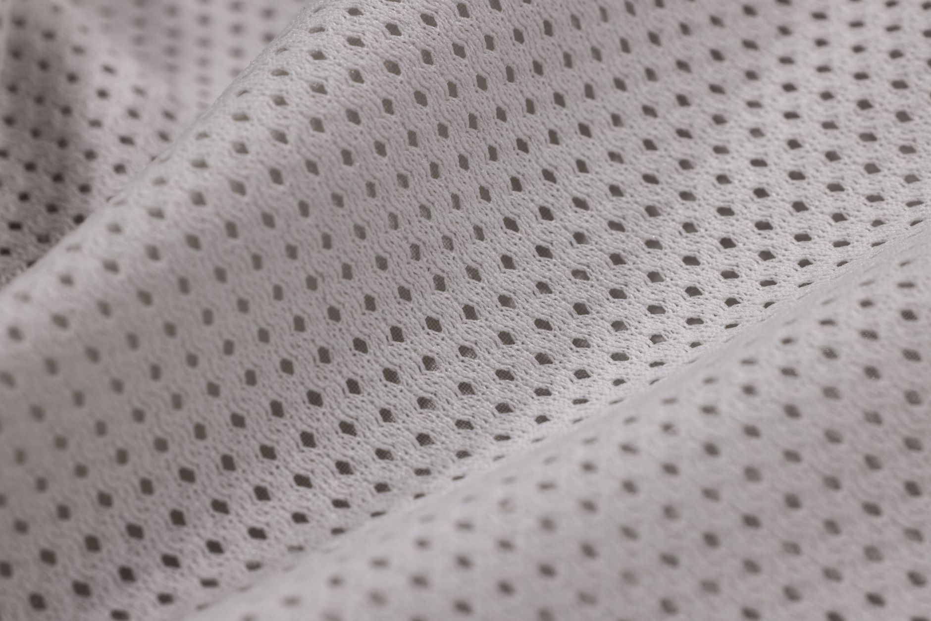
The texture dropped out along with the color
Beige used to mean linen, camel hair, undyed cotton—materials that improved with age and carried their own warmth. Now neutral means technical fabric, bonded seams, performance blends that resist wrinkling and therefore resist living. The shift from natural to synthetic happened so gradually we barely noticed, but your body did. There's a reason these clothes feel like wearing a very expensive tarp. They're engineered for durability, not comfort, and certainly not intimacy.

Ice blue is gray's sociopathic younger sister
Just when you thought neutrals couldn't get more emotionally distant, fashion discovered ice blue. Technically a color, functionally an absence. It's the shade of hospital corridors and fluorescent-lit airports, now repositioned as aspirational. Brands are pushing it as "calming" and "elevated," but what it actually communicates is sterility. There's nothing calm about a palette that makes human skin look like it needs medical attention.
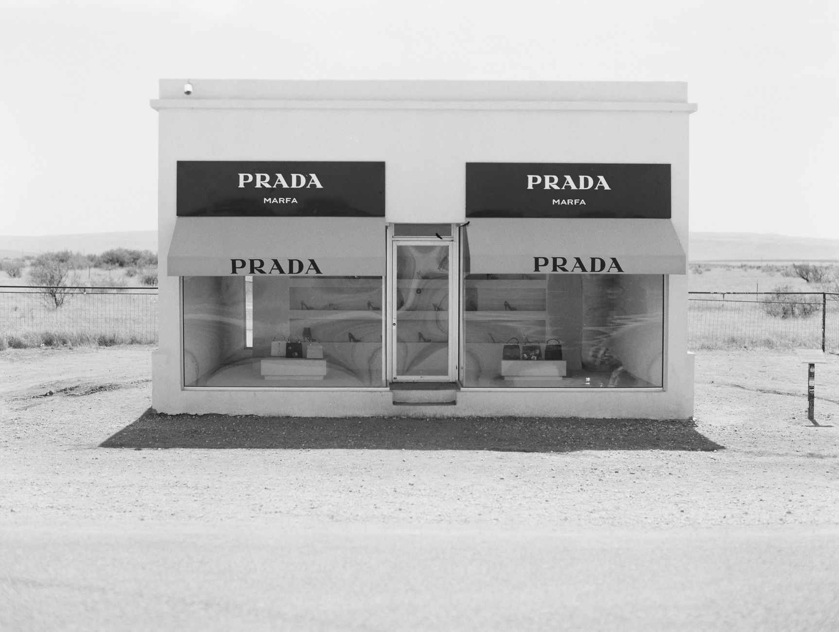
We confused 'quiet luxury' with emotional unavailability
The quiet luxury movement was supposed to be about quality over flash, but it metastasized into something colder: wealth signaling through deliberate inaccessibility. The colors got paler, the fabrics got stiffer, the stores got emptier. What's actually quiet about luxury now is that it refuses to speak to you at all. These neutrals aren't understated—they're withholding. The hospitality died because hospitality requires acknowledging that another person exists, and that's simply not the vibe.